The Main Logos of the NHL: New York Islanders
NHL team logos have always garnered admiration for their prominent display on uniforms, a stark contrast to other major North American sports leagues (NFL, MLB, and NBA). In those leagues, logos are often relegated to less visible positions on uniforms, though they are certainly prominent on their respective fields or courts.
Undoubtedly, each team's logo serves as its most crucial identifier. In most instances, these designs are meticulously crafted to embody various elements of the city or its surrounding area. Beyond merely representing the team, the logo itself acts as the visible face of the brand, instantly recognizable to a vast majority of sports fans.
The Isles have had five primary logos since their inception in 1973.
This article is part of a series that reviews the primary logos of each NHL franchise (32 in total). On this occasion, we focus on the New York Islanders, the Uniondale-based franchise that dominated the NHL in the early 1980s.
The Islanders quickly established themselves as one of hockey's most iconic dynasties, winning four consecutive Stanley Cups just ten years after joining the NHL through expansion. This remarkable achievement elevated their rivalry with their neighbors, the New York Rangers, to a more elite status.
1973 – 1995
The Islanders' original logo, quite similar to their current one, featured the silhouette of a portion of Long Island, the franchise's home. The abbreviation for New York (NY) appeared in conjunction with the team's name at the bottom. Orange, white, and blue were the prominent colors of the emblem, matching the color palette used in the New York City flag.
1995 – 1997
In the mid-1990s, the Islanders made a radical change to their logo, abandoning the classic circular design for a new emblem dominated by a fisherman holding a hockey stick (colloquially known as the 'Fisherman'). This logo also featured a net, waves, and the 'Islanders' name, which remained on the emblem. Light blue was added to the existing color palette. It's worth noting that this logo became one of the most heavily criticized in league history, even by the team's own fans and players in Uniondale, which is why it was only active for two seasons.
1997 – 2010
Following the widely criticized 'Fisherman' logo, which was often mocked by New York Rangers fans, the franchise owners decided to revert to the original design but with some modifications. The color palette was slightly darkened, particularly the blue, which became navy. Two circles, one orange and one dark blue, were added to the logo, giving the emblem's edges a more polished finish. The interior design of the logo remained unchanged.
2010 – 2017
After 13 years with the 'darker' version of their original logo, the Islanders decided to give the emblem a classic touch by reintroducing the 1973 color scheme. However, one of the two circles, the orange one, remained, with only the outermost blue circle being removed.
2017 – Present
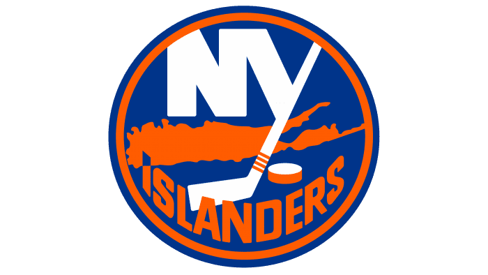
After using the previous version for about seven years, the franchise once again applied a layer of refinements to the classic logo, re-adding a blue circle to the outermost edge of the emblem. Two interesting details, often overlooked, are the tip of the 'I' in 'Islanders', which is embedded in the island map, pointing to Nassau County, the New York team's home. Additionally, the four orange lines on the hockey stick symbolize the four Stanley Cups won by the Islanders.
Fresh materials — NHL

Mike Sullivan: Architect of the Pittsburgh Penguins' Last Dynasty
In the highly competitive landscape of the National Hockey League (NHL), only a handful of coaches manage to leave an indelible mark on a franchise's history. Mike Sullivan is one of those select strategists who not only transformed a team but also built a lasting legacy. With two con

NHL Central Division: A Fan's Guide to Every Team
Are you new to hockey after watching the Olympics or the series More Than Rivals, and wondering where to start with the NHL? We've got you covered! We offer a dictionary and a comprehensive guide, and we've assembled a "super-team" of fans (like the Avengers) to introduce you to each team. Ple

A Look Back at the Legendary Nassau Veterans Memorial Coliseum
The iconic home of the New York Islanders, the Nassau Veterans Memorial Coliseum, officially bid farewell to its tenure in the NHL world. This departure followed the Islanders' elimination during the 2022 postseason, where they were defeated by the Tampa Bay Lightning, having advanced to the p
Un paseo por el mítico Nassau Memorial Coliseum
El icónico Nassau Veterans Memorial Coliseum, hogar histórico de los New York Islanders, se despidió de la NHL tras la eliminación del equipo en los playoffs de 2022. Los Islanders llegaron a la penúltima ronda, cayendo ante los Tampa Bay Lightning en una memorable postemporada. El hockey

The Bruise Brothers: The Most Feared Duo in Red Wings and NHL History
Drafted in the 1983 NHL Entry Draft, the same year the Detroit Red Wings selected Steve Yzerman fourth overall, Bob Probert and Joey Kocur forged one of the most formidable duos in the history of the franchise and the entire league. During an era defined by physical hockey, both embraced the ro

February NHL Content Recap: Articles, Interviews & Reports
With February now concluded, it's the perfect time to bring together all the captivating articles, in-depth interviews, thoughtful opinion pieces, and comprehensive reports that were published during the month. This curated compilation offers an excellent opportunity for readers to revisit the